Pantone Spot Colors
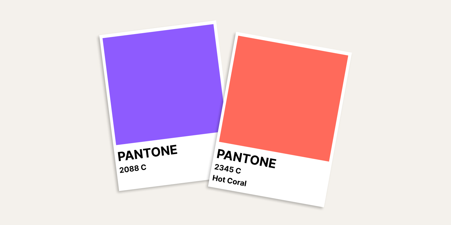
Pantone is a spot colour system used when a brand colour has to be exact - one premixed ink, printed flat on its own. It sits beside CMYK, the four-ink process build that handles continuous tone. An exact logo colour is matched to a Pantone reference at file intake.
Intro
When a logo has an exact brand colour that has to look right on every item, a four-ink build is not quite enough. This page is the plain-language answer to what Pantone is, why it matters for an exact brand colour, and how it sits beside the CMYK you already met on the CMYK vs RGB page.
What Pantone actually is
Pantone is a spot colour system. A spot colour is one ink - mixed to a fixed formula and printed flat on its own layer - rather than a combination of inks built up to approximate a colour. Because the ink itself IS the colour, a spot prints predictably and exactly the same every time.
CMYK, by contrast, builds each colour by layering four inks (Cyan, Magenta, Yellow, Black). It is open to almost any colour and handles continuous tone - gradients and photographs - very well. But a brand red built from CMYK is a close rendition, not exact, because the mix of four inks can land slightly differently from one run to the next.
When Pantone is right
- Pantone for an exact brand colour - a logo red, a corporate green, a flat colour that must hold identically across products. Matched to a spot, it reproduces the same every time.
- CMYK for continuous tone - photographs, gradients, full-colour photographic artwork.
A logo often uses both: the flat brand colour is carried as a spot, and any photography or gradient on the same item runs in CMYK. The two sit side by side; neither is better, they do different jobs.
Which print methods use it
The print method decides the colour system. Per our production setup: silkscreen, pad print and transfer print work with Pantone spot colours - which is why those techniques can hold an exact brand colour. UV and digital transfer print work in CMYK full colour, laser engraving is a monochrome material-tone mark, and embroidery uses physical thread cards rather than a colour system.
So a Pantone requirement matters most when the item is going through a spot-colour technique - the ones printing a logo with an exact brand colour.
The file you send
When a brand colour has to be exact, we request a Pantone reference at file intake. If you don't have the code to hand, we ask you to pick a Pantone reference or send a brand colour file, and we match the print from that. This step is what lets a logo red come out the same red on the hundredth mug as on the first.
How SoMerch fits in
The file check at intake looks at the colour system alongside the format: exact brand colour - spot, continuous tone and photography - CMYK. We match the two to the right method and confirm the Pantone reference before we set production, so the colour is right before anything prints, not discovered at delivery.
The short version
Pantone is a spot colour system for an exact brand match - one ink, flat and predictable. CMYK is the four-ink process build for tone and gradients. An exact brand colour prints to a Pantone reference, we request it at intake, and we match from it.