Corporate Logo Gifts: The Same Logo Doesn't Reproduce the Same Way Twice
Corporate logo gifts look like the simplest gift order. Here's why the same logo file doesn't automatically reproduce well everywhere it lands.
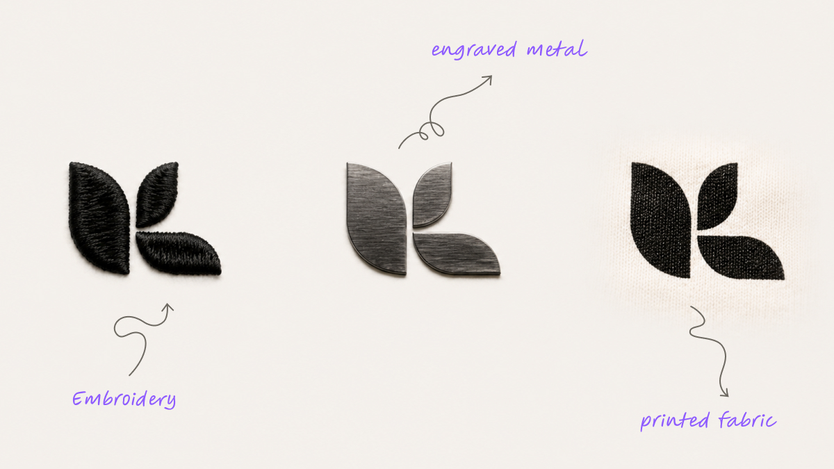
Intro
"Just put the logo on it" sounds like the simplest gifting request there is, because the design itself isn't in question - it already exists, already approved, already sitting in a brand folder somewhere. What rarely gets asked is a separate, more technical question: does that one fixed logo file actually reproduce well on every specific item it's about to land on.
The logo is fixed. Where it lands isn't.
A single logo file typically gets used across a gift order that spans several genuinely different items and materials - fabric, hard plastic, metal, paper stock. What renders cleanly on a flat notebook cover doesn't automatically render the same way on embroidered fabric, a curved drinkware surface, or a small metal accessory. Corporate logo gifts assume one input can serve every output equally well, and that assumption is exactly where the risk sits.
It's an easy assumption to make, because the logo itself doesn't change from item to item - the same file gets handed over once, and from there it feels like a solved problem. But a logo file is really just an instruction, and every material and print method interprets that instruction slightly differently. A vector file with fine serif detail behaves one way on a flat printed surface and an entirely different way once it has to be rendered in stitched thread or engraved into metal.
"Simple" describes the design decision - there's nothing left to create. It doesn't describe the production reality, which varies meaningfully depending on the material and the print method involved.
Where it actually breaks down
Fine detail in a logo can disappear entirely once it's embroidered instead of printed, because thread simply can't hold the same resolution as ink on paper or a digital print. A color that reads correctly on one material can shift noticeably on another - fabric dye behaves differently from a coating on a hard surface, even when the same color code is specified for both.
A mark sized comfortably for a large item - a tote bag, a notebook cover - gets shrunk down for a smaller one until fine lines blur together or proportions distort in ways that weren't visible at full size. Take a fairly ordinary case: a single logo file used across a mixed gift order covering apparel, a notebook, and a small tech accessory. On the apparel and the notebook, the mark looks sharp and accurate. On the tech accessory, the same file comes out slightly blurred and noticeably off-color, because nobody checked how that specific print method handled the file's finer detail before the full batch went to production.
None of this shows up as an obvious mistake at the ordering stage. The file gets approved once, at full size, on a screen - and a screen doesn't tell anyone how a logo will actually sit once it's compressed onto a two-centimeter clip or stitched at low thread-count resolution. The gap between "approved on screen" and "correct on the actual item" is exactly where corporate logo gifts most often go quietly wrong, order after order, without anyone updating the process to catch it.
Why this is a reproduction problem, not a design problem
The logo itself is rarely the actual issue behind a disappointing batch of corporate logo gifts. By the time an order gets placed, it's usually a finished, already-approved asset that nobody has any reason to second-guess.
The overlooked piece is checking how that one fixed asset behaves across each specific item, material, and print method involved in the order. Every print method and every material has its own resolution limits and its own color behavior, and a logo file that's never been tested against a particular combination is a genuine unknown - not a safe assumption just because it looked fine somewhere else.
What actually protects logo reproduction
The fix isn't commissioning a better or simpler logo file. It's a proofing step that checks the actual logo against each specific item and print method in the order before a full batch runs, rather than assuming one approval covers every format the mark will ever appear on.
Treating a mixed-item order as several separate reproduction checks - one per item type, not one blanket check for the whole order - is what actually catches a mismatch before it becomes a finished batch. Catching a resolution or color issue on a sample costs one item and a short delay. Catching the same issue after a full run has shipped costs considerably more, and it costs it in front of whoever receives the item.
How SoMerch fits
A range of customization methods - full-color digital transfer, UV, edge-to-edge sublimation, silkscreen, pad print, laser engraving - each suited to different materials means the print method gets matched deliberately to the item, rather than one method forced across everything regardless of fit. Tiered QA with photo proofs before dispatch means logo reproduction gets checked per item as a matter of course, not assumed to be fine simply because the file itself was approved once, early in the process.
Mockups produced the same day mean a logo can be tested against a specific item before a full batch is committed, catching a resolution or color mismatch while it's still cheap to adjust. This connects to the broader corporate gifting problem, and to the same underlying issue covered in the brand identity work more broadly - the difference here is reproduction across different items within a single order, rather than consistency across offices and time.
Closing
Corporate logo gifts are simple in concept and genuinely technical in execution. The design was never the risk - it was finished and approved long before the order went in. Whether it reproduces correctly on the specific item it's actually landing on is the part worth checking, and it's a five-minute check against a real production risk, not an extra step added for its own sake.